Fool-Proof Guide to Choosing a Colour Palette
Choosing a colour palette for your home can be overwhelming. You want to make sure the colours you choose will work well together and create a cohesive look throughout the room. But fear not, there is a tried and true way of creating a colour palette that is easy to implement and looks amazing. Yes, we're talking about the colour wheel, and in this blog post, we'll show you how to use it to create a fool-proof colour palette that you'll love.
The colour wheel is organized in a way that shows how colours naturally combine, blend, and contrast. There are twelve colours on the wheel, divided into three categories: primary, secondary, and tertiary.
Primary colours include red, yellow, and blue. All other colours are created by combining these three colours. Secondary colours are created when you mix two primary colours together. The secondary colours are orange, green, and violet.
Tertiary colours are formed by mixing a primary colour with a secondary colour next to it. These colours are yellow-orange, red-orange, red-violet, blue-violet, blue-green, and yellow-green.
Now that we have a better understanding of the colour wheel, let's talk about colour schemes. There are several popular colour schemes that designers use when choosing colour palettes.
The monochromatic colour scheme is created by using different shades and tints of the same colour. This is a great way to add depth to a room without adding too many different colours. Analogous colour schemes use colours that are next to each other on the colour wheel, such as blue and green. This creates a harmonious look that is easy on the eyes.
The complementary colour scheme uses colours that are opposite each other on the colour wheel, such as blue and orange, to create a bold and eye-catching look. Split complementary colour schemes use one colour and the two colours next to its complement on the colour wheel. For example, a split complementary colour scheme could use green, red-orange, and yellow-orange.
Lastly, the triadic colour scheme involves using three colours that are equidistant from each other on the colour wheel. This creates a vibrant and playful look. One example of a triadic colour scheme is blue, yellow, and red.
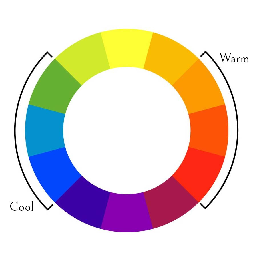
Before choosing a colour scheme, it's important to think about the mood you want to create in your space. Blues, greens, and purples tend to be cooler tones that are more calming, while oranges, yellows, browns, reds, and pinks are warmer tones that are more exciting. Once you know what kind of feel you want in your room, you can choose a colour scheme that reflects that.
In Summary
Choosing a colour palette for your home doesn't have to be stressful. By understanding the colour wheel and different colour schemes, you can create a fool-proof colour palette that looks amazing. Remember to think about the mood you want to create in your space and choose colours that reflect that. Happy decorating!
The colour wheel is organized in a way that shows how colours naturally combine, blend, and contrast. There are twelve colours on the wheel, divided into three categories: primary, secondary, and tertiary.
Primary colours include red, yellow, and blue. All other colours are created by combining these three colours. Secondary colours are created when you mix two primary colours together. The secondary colours are orange, green, and violet.
Tertiary colours are formed by mixing a primary colour with a secondary colour next to it. These colours are yellow-orange, red-orange, red-violet, blue-violet, blue-green, and yellow-green.
Now that we have a better understanding of the colour wheel, let's talk about colour schemes. There are several popular colour schemes that designers use when choosing colour palettes.
The monochromatic colour scheme is created by using different shades and tints of the same colour. This is a great way to add depth to a room without adding too many different colours. Analogous colour schemes use colours that are next to each other on the colour wheel, such as blue and green. This creates a harmonious look that is easy on the eyes.
The complementary colour scheme uses colours that are opposite each other on the colour wheel, such as blue and orange, to create a bold and eye-catching look. Split complementary colour schemes use one colour and the two colours next to its complement on the colour wheel. For example, a split complementary colour scheme could use green, red-orange, and yellow-orange.
Lastly, the triadic colour scheme involves using three colours that are equidistant from each other on the colour wheel. This creates a vibrant and playful look. One example of a triadic colour scheme is blue, yellow, and red.
Before choosing a colour scheme, it's important to think about the mood you want to create in your space. Blues, greens, and purples tend to be cooler tones that are more calming, while oranges, yellows, browns, reds, and pinks are warmer tones that are more exciting. Once you know what kind of feel you want in your room, you can choose a colour scheme that reflects that.
In Summary
Choosing a colour palette for your home doesn't have to be stressful. By understanding the colour wheel and different colour schemes, you can create a fool-proof colour palette that looks amazing. Remember to think about the mood you want to create in your space and choose colours that reflect that. Happy decorating!